Visionware
The UX team was tasked with designing the vision of our product to be shown to industry leaders at an annual conference we host called One Continuum. I designed a personalized dashboard, and client facing app that allows clients seeking social care to track their care navigation
ROLE
Lead UX Designer
IMPACT
Presented at One Continuum connecting industry leaders and established product vision
Challenge

The care managers and social service organizations that engage with our app daily are faced with a very large set of tasks that can feel overwhelming and often times unmanageable.
Our app's main dashboard consists of a left and top nav (highlighted in red and green), where users can manage referrals, cases tasks and other tools. These feature sets often feel disjointed and don’t reflect the centralized workflow our users actually need.
Approach

Personalized Dashboard
Widgets highlight priorities for the user's workflow. This includes a task list, an org-wide activity feed and client intake details. This helps users focus their daily tasks through complex workflows.


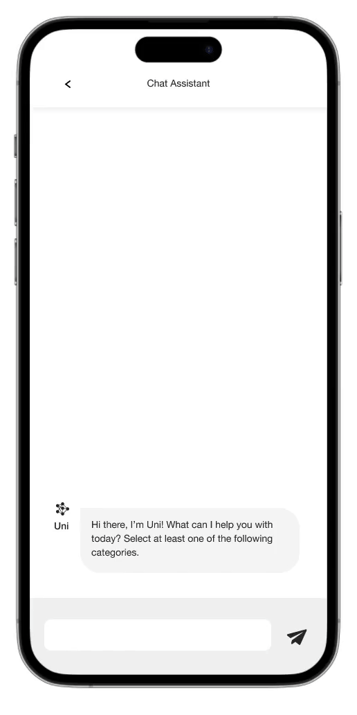
Client Portal
A client facing app allows users to speak directly with their care managers and track their care journey. It also gives them a personalized view of the resource directory guiding them to the care they need.
AI Chat Screening